THE TOP 10
TV CAMPAIGNS OF 2003 |
1 ALPENLIEBE:
LAGEY RAHO
RMG DAVID, MUMBAI
2 COCA-COLA:
AAMIR KHAN AS A GURKHA
McCANN ERICKSON, MUMBAI
3 BRITANNIA
GOOD DAY: RAHUL DRAVID AND VIRENDER SEHWAG
LOWE, BANGALORE
4 HUTCH:
YOU AND I
O&M, MUMBAI
5 BAJAJ
CALIBER: HOODIBABAA!
LOWE, MUMBAI
6 VIP
LUGGAGE: BYE BYE
LOWE, MUMBAI
7 PEPSI:
TENDULKAR, HOOPER AND WARNE
JWT, DELHI
8 VIDEOCON:
SHAH RUKH KHAN
SSC&B, MUMBAI
9 TVS
VICTOR: SACHIN TENDULKAR
SAATCHI & SAATCHI, BANGALORE
10 BRITANNIA
LITTLE HEARTS: PARTHIV PATEL
LOWE, BANGALORE |
THE TOP 10
PRINT ADS OF 2003 |
|
1 HUTCH:
WHEREVER YOU GO
O&M, MUMBAI
2 SET:
JASSI JAISI KOI NAHIN
EURO RSCG, MUMBAI
3 AIRTEL:
ARE YOU WITH ME?
REDIFFUSION DY&R, MUMBAI
4 BAJAJ
PULSAR: PUT LESS IN THE TANK
O&M, MUMBAI
5 BAJAJ
CALIBER: HOODIBABAA!
LOWE, MUMBAI
6 NOKIA:
FREE LOGOS, GAMES, AND RINGTONES
BATES, DELHI
7 TANISHQ:
CHAINS
LOWE, BANGALORE
8 COCA-COLA:
QUALITY...TRUST
COCA-COLA INDIA
9 NESCAFE:
THE ESSENTIAL DIYA DIARY
MCCANN ERICKSON, DELHI
10 MARUTI
ZEN: CONFIDENT & COOL
HAKUHODO PERCEPT, DELHI
|
| THE TOP 10 TV
AD CAMPAIGNS OF 2003 |
| THE TOP 10 TV
AD CAMPAIGNS OF 2003 |
| The Methodology |
Walk into the office of Ogilvy &
Mather India Chairman and National Creative Director Piyush Pandey,
in Lower Parel, a Mumbai suburb, and you'll find Walt Disney's famous
words staring you in the face from one of the nicely done up walls:
"I would rather entertain and hope that people learned something
than educate people and hope they were entertained."
That, incidentally, is the common thread that runs through most
of the ads that emerged winners in the BT-TNS survey of the top
10 television campaigns and the top 10 print ads of 2003 (See The
Methodology, Page 107).
Would you watch, let alone believe, an ad that simply extols a
mobile network's omnipresent reach? But the idea of a pug as Hutch's
network (No. 1 in our print list and No. 4 in TV) following a reluctant
kid everywhere, is pure entertainment and, therefore, consumed easily.
The necessity to sell to an increasingly ad-wary consumer has
resulted in a clutch of ads, across TV and print, which are more
stories that reflect everyday mood of ordinary people, in a light,
humourous way and less sales pitches.
The campaign that topped our TV list, Alpenliebe lollipop's Lagey
Raho, is an entertaining use of situational comedy and street lingo
to build a brand connection. And it did not even need big bucks-it
just spent Rs 3-crore on media- to create a big bang with consumers.
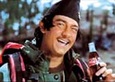
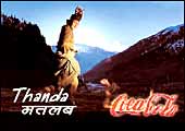
Or take the endearing Aamir Khan as the gurkha in Thanda Matlab
Coca-Cola ad (No. 2 in the TV list). With strong emphasis on storytelling
that consumers savour, the brand has managed to usurp the colloquial
genre of thanda for itself.
Given all the noise about audiences becoming tired of celebrities,
our list throws up quite a few surprises. Almost half of all the
ads in the honours club, 9 out of the 20 in the list, have celebrities
in them. And it is not just Coke and Pepsi, but brands and categories
of all manner, from coffee, cars, mobiles, TVS and motor bikes that
seem to ride on them, quite successfully. Even biscuit advertising,
from Britannia, uses as many as four Indian cricketers!
Hutch and Bajaj Caliber have pride of place across the TV and
print lists, proving once again the multiplier effect of a well-thought-out
multi-media campaign. It's a pity that there are no more examples
here, a sad reflection on the mindset of most advertisers who still
think in silos as far as media is concerned!
The Top Ten
TV AD CAMPAIGNS OF 2003
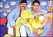 |
| Simplicity pays: Josy Paul (with cap)
and Vishal Mittal have made Alpenliebe lollipops cool even in
college canteens |
No. 1
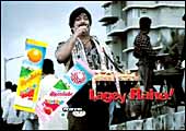
Alpenliebe: Lagey Raho!
Call
it the triumph of a simple idea over modest means. "Perfetti
wanted to appropriate Lagey Raho (keep going) as the brand's promise,"
explains Josy Paul, Country Manager and National Creative Director,
RMG David. A strategic brand need to extend lollipops to young adults
meant continuing on the young adult-driven Lagey Raho theme (introduced
in the preceding, thumb-sucking, campaign). The ad had to address
a wider age group, even while appealing to kids. "We thought
of many situations for the film, but finally went with the one that
introduced the product in a very indirect manner," says Vishal
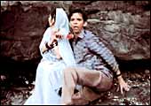
Mittal, Creative Group Head, RMG David. A lollipop hawker inadvertently
and unintentionally gets into people's everyday lives, whether it
is a young couple on the beach, a tea-vendor urinating on a street
corner or a beggar pretending to be blind. The three-ad campaign,
backed by a Rs 3-crore media spend, uses everyday situational humour
to drive home the brand-LageyRaho has almost become a brand proxy.
"Alpenliebe lollipop is now available even in college canteens,"
says Sameer Suneja, Head of Marketing, Perfetti Van Melle India.
Lagey Raho!
-Shailesh Dobhal
 |
 BRAND:
Alpenliebe Lollipop BRAND:
Alpenliebe Lollipop
CLIENT: Perfetti Van Melle India
AGENCY: RMG David, Mumbai
CREATIVE TEAM: Josy Paul (National
Creative Director) and Vishal Mittal (Creative Group Head)
PROD. house/producer: Corcoise/Prasoon
Pandey, Prashant Issar, and Cyrus Pagriwala |
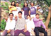 |
| Heil Creativity!: Prasoon JOshi (second
from left, sitting) with his crack troops |
No. 2
Coca-Cola: Thanda Matlab...
Encouraged by the success of the
Aamir Khan Thanda Matlab Coca-Cola ads, Coca-Cola India wanted McCann
Erickson to create something new and captivating. "Any campaign
dies when it becomes predictable and that's a mistake I consciously
tried to avoid," says Prasoon Joshi, National Creative Director
and the copywriter of this campaign.
To reach out to the mass consumer, the campaign obviously had
to feature characters people were familiar with. "The frame
of reference was the Gurkhas and Bahadurs, essentially Nepalis who
work in India and with whom all of us are acquainted," adds
Joshi. The script was crafted in two days, and cleared virtually
over the phone by Coca-Cola India's marketing head Shripad Nadkarni,
who was in South Africa.
Shot in Manali over a week, the idea was brilliantly executed
thanks to Aamir Khan, who not just worked on the dance steps, but
also did his own extremely 'real' makeup to look like a Gorhka.
The ads haunting melody, Beru Pako, is based on a folk tune from
Kumaon region of Uttaranchal. Incidentally, it's also the wake-up
tune for the Indian Army's Kumaon Regiment.
-Abir Pal
 |
 BRAND:
Coca-Cola BRAND:
Coca-Cola
CLIENT: Coca-Cola India
AGENCY: McCann Erickson, Mumbai
CREATIVE TEAM: Prasoon Joshi (National
Creative Director) and Akshay Kapdanak (Art Director)
PRODUCTION HOUSE/ PRODUCER: Aamir
Khan Productions/Ashutosh Gowarikar |
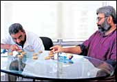 |
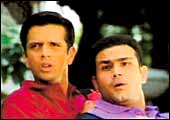
| Taking aim: R. Balakrishnan (left) and
Ashit Desai offer biscuits as kheer |
No. 3
Britannia Good Day: Kheer Anyone?
A biscuit with almonds, cashews,
pistachios, and butter in it. "It's special, yet an inexpensive
biscuit meant for everyday consumption. The challenge was how to
communicate that," says R. Balakrishnan (aka Balki), National
Creative Director, Lowe India. It helped that the client, Britannia
Industries, had a number of Indian cricketers as brand endorsers.
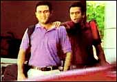
For in a cricket-crazed country such as India, any ad with Rahul
Dravid and Virender Sehwag in it has already won half the battle
even before the first creative is penned! The apt analogy of kheer-rich
in content and yet an everyday, affordable dessert -helped communicate
the brand's benefits.
-Shailesh Dobhal
 |
 BRAND:
Britannia Good Day BRAND:
Britannia Good Day
CLIENT: Britannia Industries
AGENCY: Lowe India, Bangalore
CREATIVE TEAM: R. Balakrishnan
(National Creative Director), Ashit Desai (Group Creative Director),
and Abhijit Ghosh (Creative Director)
PRODUCTION HOUSE/PRODUCER & DIRECTOR:
MAD/Sunil Manchanda and Priyadarshan |
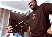 |
| Creating pug marks: (From left) Piyush
Pandey, Mahesh V., and Rajeev Rao (not in picture) have made
history for Hutch |
No. 4
HUTCH: You & I in this beautiful world
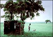
The dog (its name is cheeka) wasn't
supposed to be. For when Mahesh V. and Rajeev Rao, Senior Creative
Directors at Ogilvy & Mather Advertising, got thinking on Hutch's
brief of communicating a robust and serious mobile network, the
first idea straight from the gut was a little sister following her
brother. "On second thoughts, we concluded that a dog would
be much less mushy," says Mahesh.
"To me the magic of this campaign is its simplicity,"
says Piyush Pandey, National Creative Director. And the guts of
a client to accept a dog as the symbol of its network. The rest,
as they say, is history. Many copycat ads, using a boy and a dog,
have already hit TV. And apparently, prices of pug pups, have gone
up from Rs 15,000 to Rs 25,000 after this Hutch campaign. "Hutch
(the client) saw the ad. Spoke nothing and just hugged our team,"
adds Pandey. Need we say more.
-Shailesh Dobhal
 |
 BRAND:
Hutch BRAND:
Hutch
CLIENT: Hutch
AGENCY: Ogilvy & Mather, Mumbai
CREATIVE TEAM: Mahesh V. (Senior
Creative Director) and Rajeev Rao (Senior Creative Director)
PRODUCTION HOUSE: Nirvana Films/Prakash
Varma & Sneha Varma |
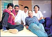 |
| Creating pug marks: (From left) Piyush
Pandey, Mahesh V., and Rajeev Rao (not in picture) have made
history for Hutch |
No. 5
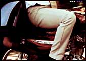
Bajaj Caliber 115: Hoodibabaa!
Initially a fluke called Hoodibabaa
happened," says R. Balakrishnan (aka Balki), National Creative
Director, Lowe India. For Balki and his team were trying to find
a word to describe Bajaj Auto's revamped motorcycle in Bajaj Caliber
115, with more power and mileage, without saying wow. "Suddenly
this completely meaningless word, Hoodibabaa, came to me, and we
knew we are on to something big." One thing led to another,
the father-son relationship and the 'Hodibabaa Dad'.The ad, a new
account for Lowe (moved from Leo Burnett), kicked in instantly with
the client and quickly seeped in popular street culture. "The
most touching thing I heard was about this autistic kid, who was
unable to speak, uttered his first word. Hoodibabaa," adds
Balki. Who says ads just help sell products?
-Shailesh Dobhal
 |
BRAND:
Bajaj Caliber
CLIENT: Bajaj Auto
AGENCY: Lowe India, Mumbai
CREATIVE TEAM: R. Balakrishnan
(National Creative Director), Rahul Sengupta (Group Creative
Director), Narendra Yadav (Unit Creative Director), Manisha
Khandelwal and Parikshit Bhattacharya
PRODUCTION HOUSE/PRODUCER-DIRECTOR: MAD/
Sunil Manchanda & Lalli |
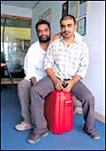 |
| Tripmaster Redux!: (From left) R. Balakrishnan
and Aimer Jaleel have made travelling with VIP a memorable experience |
No. 6
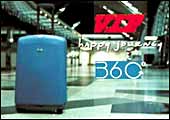
VIP Luggage: Bye Bye, Bye Bye...
Why such an obviously international
look and feel campaign? Is that the question you're also asking
about this foot-tapping number by Lowe for VIP luggage? "The
need for this campaign was to give VIP a world imagery and make
it more strongly associated with international travel," explains
R. Balakrishnan, Lowe's National Creative Director. Luggage is strongly
linked to travel, and yet it is the most cumbersome and forgettable
part of the experience. "We thought the only moment VIP can
own is the time when people leave (for travel). It can own wishing
'Happy Journey'," adds Balki. And so the brand has bravely
made a play for the term bye bye, hoping that it will become a signature
theme. VIP Industries' research, post campaign, shows the brand
in a much more contemporary light. Well, bye bye old imagery.
-Shailesh Dobhal
 |
 BRAND:
VIP Suitcase BRAND:
VIP Suitcase
CLIENT: VIP Industries
AGENCY: Lowe India, Mumbai
CREATIVE TEAM: R. Balakrishnan
(National Creative Director), Aimer Jaleel (Unit Creative Director),
and Vasudha Narayanan (Unit Creative Director) |
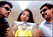 |
| Inki to gayi!: (From left) Rohit Ohri,
Anuja Chauhan, and Alok Lal |
No. 7
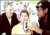
Pepsi: Iski To Gayi
How do you take one of the most celebrated
sporting rivalries in recent times and make it work for your brand?
Ask Anuja Chauhan, VP (Creative), J Walter Thompson. She took Sachin
Tendulkar and Shane Warne (remember, he admitted to having nightmares
about Tendulkar giving him a tough time on the field), added Carl
Hooper and created Pepsi's yet another memorable 'Yeh Dil Maange
More' campaign around the World Cup Cricket 2003. For any rival
team in the World Cup 2003, the common fear factor was master blaster
Tendulkar. The campaign highlighted this in a manner only Pepsi
can-Tendulkar losing his memory and Warne calling him a chef, a
veiled reference to the opening of the restaurant, Tendulkar's.
And Hindi lines such as Iski To Gayi (he's had it) mouthed by Warne
just added to the ad's appeal, as did ad director Prahalad Kakar
in the role of the turbaned pilot. And did you know that Warne came
for this shoot to India without a visa? He didn't think you needed
one for India!
-Amanpreet Singh
 |
BRAND:
Pepsi
CLIENT: PepsiCo India
AGENCY: J Walter Thompson
CREATIVE TEAM: Anuja Chauhan (Vice
President, Creative), Rohit Ohri (Senior Vice President), and
Alok Lal (Vice President)
PRODUCTION HOUSE/DIRECTOR: Genesis
Films/Prahalad Kakar |
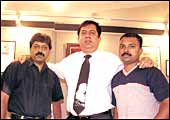 |
| Warm as melons: (From left) Satish Ambiwadekar,
Ajay Chandwani, and Sandeep Sawant |
No. 8
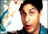
Videocon: Technology For Health...
The client wanted us to create a
single unified image for all its products," says Ajay Chandwani,
President, SSC&B Lintas. And highlight the technology edge over
the competitors. The agency's creative team came up with the 'Technology
for Health and Pleasure' theme. Instead of extolling the virtues
of the products, the four 20-second TV ads focus on Shah Rukh Khan
as a person and how Videocon appliances make life easy for him.
Ideated and executed over two months, the visuals have a warm feel
to them with Khan eating a watermelon or fooling around with a kid.
"The campaign was very subtle and un-ad like. The idea was
not to push products," adds Chandwani. It did.
-Abir Pal
 |
BRAND:
Videocon, Appliances
CLIENT: Videocon
AGENCY: SSC&B Lintas, Mumbaii
CREATIVE TEAM: Ajay Chandwani (President),
Vikram Divecha (Senior Copy Writer), Satish Ambiwadekar (Creative
Director), and Sandeep Sawant (Senior Art Director)
PRODUCTION HOUSE/DIRECTOR: ArcLights/Santosh
Sivan |
No. 9
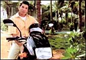
TVS Victor: More Smiles Per Hour!
Our challenge was to use Sachin Tendulkar
as a metaphor for TVS Victor," says Arijit Ghosh, Head of Saatchi
& Saatchi, Bangalore. Visuals of Tendulkar, in the first of
the three-ad campaign, checking for the right kind of bat were,
in a way an effort to convince the audience that the man chooses
everything with care, including his bike. The 'More Smiles Per Hour'
slogan was an instant hit as it suited the brand theme of showing
the other side of Tendulkar, and the bike. The second and third
ads, therefore, moved the communication away from a mere functional
plank to a warmer touch-and-feel one with Tendulkar cooking for
a family gathering and riding the bike on the beach. "This
campaign has been one of our most successful ones, given the need
to match the attributes of the product with that of the brand ambassador,"
adds Ghosh.
-Venkatesha Babu
 |
BRAND:
TVS Victor
CLIENT: TVS Motor
AGENCY: Saatchi & Saatchi,
Bangalore
CREATIVE TEAM: Shanta Kumar (CEO),
S. Ghosh (COO), Ramesh Ramanathan (National Creative Director;
left the agency for Mudra), and Rajiv Ravindranath (Creative
Supervisor)
PROD. HOUSE/PRODUCER: Genesis Films/Prahalad
Kakar |
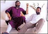 |
| Winning hearts: (From left) Ashit Desai
and R. Balakrishnan |
No. 10
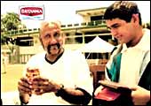
Britannia Little Hearts
A Little Sweetness In All Of Us
It's a sweet biscuit. The core of
the brand is slight sweetness inside everybody," says R. Balakrishnan,
National Creative Director, Lowe. Earlier campaigns on the brand
had explored themes such as 'Straight from the Heart' with people
speaking the truth on everyday issues. The idea this time was to
communicate, in a light, non-mushy manner, the core of the brand.
So you have teenaged Indian wicket keeper Parthiv Patel emerging
on top of various situations, thanks to the benevolence that grips
people after eating Little Hearts. Little unbelievable, but then
its merely biscuit advertising!
-Shailesh Dobhal
 |
BRAND:
Britannia Little Hearts
CLIENT: Britannia Industries
AGENCY: Lowe India, Mumbai
CREATIVE TEAM: R. Balakrishnan
(National Creative Director), Ashit Desai (Group Creative Director),
and Abhijit Ghosh (Creative Director)
PRODUCTION HOUSE: Genesis Films/Prahlad
Kakar |
The Top Ten
PRINT ADS OF 2003
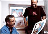 |
| Follow me: Piyush Pandey (left) and Mahesh
V. |
No. 1
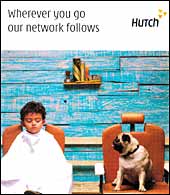
Hutch: Wherever You Go
Well, I had seen blood by then and
got involved in the print campaign," jokes Piyush Pandey, National
Creative Director, Ogilvy & Mather Advertising. But clearly,
the success of Hutch's boy and the dog 'You & I' TV campaign
(See Television Top 10, Number 4), gave the agency the drive and
the rope to do something outside mere film-stills for print. The
print ad, the boy and the dog in the barber's shop, dovetailed seamlessly
into the brand's multi-media effort at communicating an omnipresent
mobile network (the dog is the symbol of it), wherever you go. "We
even worked on pugmarks leading to lifts in buildings," adds
Pandey. Speak of multiplier effect of a well-thought out multi-media
campaign!
 -Shailesh
Dobhal -Shailesh
Dobhal
BRAND:
Hutch
CLIENT: Hutch
AGENCY: Ogilvy & Mather, Mumbai
CREATIVE TEAM: Piyush Pandey
(National Creative Director), Mahesh V.
(Senior Creative Director), and Rajeev Rao
(Senior Creative Director)
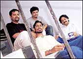 |
| Humsa koi nahin: (Clockwise from left)
Devraj Tripathi, Kapil Sawant, Ashok Karnik, and Surendra Gohey |
No. 2
Jassi Jaisi Koi Nahin (SET)
Are You Ready For Sony?
Sony entertainment Television (SET)
had a successful Spanish serial, which they wanted to Indianise.
The brief from the client was to create a buzz around the serial
before its launch. Then came the rub, recalls Ashok Karnik, Vice
President (Creative), Euro RSCG: "Jassi, the star of the show,
could not be shown." The agency hit upon the idea of using
blurbs to create an aura of intrigue around the serial. " By
using adjectives, such as calling her intelligent and beautiful,
we were able to get people interested in this 'mysterious' person,"
says Sunil Lulla, Executive VP, SET. The serial has become one of
set's biggest hits.
-Abir Pal & Kushan Mitra
 BRAND:
Jassi Jaisi Koi Nahin (Television serial) BRAND:
Jassi Jaisi Koi Nahin (Television serial)
CLIENT: Sony Entertainment Television
AGENCY: Euro RSCG, Mumbai
CREATIVE TEAM: Ashok Karnik (Vice President,
Creative), Devraj Tripathi (Copy Writer), Surendra Gohey (Visualiser),
and Kapil Sawant (Art Director), Devan Sansare (VP, Creative)
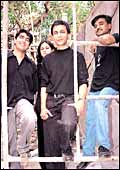 |
| Are you with us?: (From left) Manish
Sharma, Nidhi Arya, Adrian Mendonza, and Prashant Sawant |
No. 3
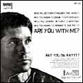
Airtel: Are You With Me? Are You On Airtel?
For long-time Sachin Tendulkar fan,
Adrian Mendonza, this assignment was extremely personal. "He's
such a super achiever-moving a billion people with a five-pound
bat-it was difficult to zero in on what to focus on," recalls
Mendonza, Rediffusion DY&R's Executive Creative Director. Doing
yet another clichéd ad that showed Sachin as a sweet, nice
guy was a strict no-no. Shot in black and white, with a gritty feel,
this ad showed an un-smiling and focussed Tendulkar issuing an invitation
few Indians could resist: "Are you with me?"
 -Abir
Pal -Abir
Pal
BRAND:
Airtel Mobile
CLIENT: Bharti Tele-Ventures
AGENCY: Rediffusion Dentsu Young &
Rubicam, Mumbai
CREATIVE TEAM: Adrian Mendonza (Executive
Creative Director), Manish Sharma (Creative Supervisor), Prashant
Sawant (Art Director), and Nidhi Arya (Senior Visualiser)
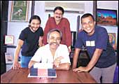 |
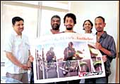
| Gaining mileage: (From left) Rajneesh
Ramakrishnan, Abhijit Avasthi, Piyush Pandey (sitting) and Vijay
Sawant |
No. 4
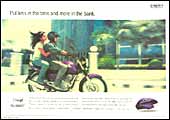
Bajaj Pulsar: Put Less In The Tank...
A 150 CC mobike that still delivers
a high 77 kilometres per litre. Anyone can say that in so many words,
but then advertising is all about stating the obvious in an interesting,
preferably a very unique manner for it to be noticed. "We had
to give the mileage statement a brand attitude," says Rajneesh
Ramakrishnan of Ogilvy & Mather, who penned the ad's punchline,
'Put less in the tank and more in the bank'. And since this was
a power bike ad, all shots were taken in motion (didn't you notice
the girl's windblown hair?) and outdoors, unlike most motorcycle
print advertising that takes stills of the bike parked inside the
studio. Now that shouldn't be much of an effort for other brands
or agencies to copy!
 -Shailesh
Dobhal -Shailesh
Dobhal
BRAND:
Bajaj Pulsar
CLIENT: Bajaj Auto
AGENCY: Ogilvy & Mather, Mumbai
CREATIVE TEAM: Abhijit Avasthi (Senior
Creative Director), Rajneesh Ramakrishnan, and Vijay Sawant
 |
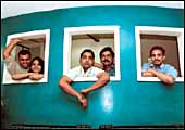
| Our caliber: (From left) Narendra Yadav,
R. Balakrishnan, Parikshit Bhattacharya, Manisha Khandelwal,
and Rahul Sengupta |
No. 5
Bajaj Caliber: 115 Hoodibabaa!
In the hierarchy of advertising consumption
and, therefore, logically, message creation, print merely follows,
and often just mirrors television. Hoodibabaa was a line penned
primarily for Bajaj Caliber 115's TV ad, and yet finds compelling
audience even in print as evident from the ad's #5 position. With
familiarity already built up with the TV campaign, print doubles
up perfectly as the promotional medium, with product detailing and
a purchase sweetener, the three-digit equated monthly instalments.
-Shailesh Dobhal
 BRAND:
Bajaj Caliber 115 BRAND:
Bajaj Caliber 115
CLIENT: Bajaj Auto
AGENCY: Lowe India, Mumbai
CREATIVE TEAM: R. Balakrishnan (National
Creative Director), Rahul Sengupta (Group Creative Director), Narendra
Yadav (Unit Creative Director), Manisha Khandelwal, and Parikshit
Bhattacharya
 |
| Stark success: (From left) Rupesh Sahay,
Anshumani Khanna, Sachin Das Verma, Anup Sharma, and Anil A.J. |
No. 6
Nokia: Download Success
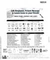
Would a stark, black and white ad,
sans visuals and colours, and with hazy images work for any festive
offer? Would it, for a Diwali-time, promotional one? Well, it did
for Nokia. Its brief to the agency, to maximise downloads-on this
direct response ad-couldn't have been met with a better response,
with 76,000 downloads, Nokia's highest for any promotion in India
till then. The minimalism of the ad was in a way a clutter-breaker
amidst a sea of me-too colour advertising during Diwali. To be sure,
even the client was initially surprised with Creative Director V.
Sunil's bold approach. But as they say, you can't argue with success.
 -Supriya
Shrinate -Supriya
Shrinate
BRAND:
Nokia
CLIENT: Nokia India
AGENCY: Bates India, New Delhi
CREATIVE TEAM: V. Sunil (Creative Director),
Sachin Das Verma (Associate Creative Director), Rupesh Sahay & Anup
Sharma (Art Directors), Anil A.J. (Mac Operator), and Anshumani
Khanna (Trainee Copywriter)
 |
| Tanishq shining: The Sharon Nayak-designed
ad helped pull in customers to the company's jewellery stores |
No. 7
Tanishq: Cleopatra In Chains!
Quickly make an ad that will drive
people to its stores, where the company was holding a limited period
exhibition-cum-sale of its jewellery, primarily chains. That was
the cryptic, no-nonsense brief from Tanishq to its ad agency, Lowe,
Bangalore. "Since it was mainly chains, I thought of Cleopatra
and Queen Nefertiti instantly, what with their long necks and high
cheek bones," says Sharon Nayak, Group Creative Director, Lowe.
It was just a day's work to find a dark toned model with high cheek
bones and embellish the look with heavy eye make up. The ad was
ready in no time, with the shot of a face of the girl, with her
head covered in Tanishq chains. It worked.
-Venkatesha Babu
BRAND:
Tanishq
CLIENT: Titan Industries
AGENCY: Lowe India, Bangalore
CREATIVE TEAM: Sharon Nayak (Group
Creative Director), and Sharad Haksar (Photographer)
No. 8
Coca-Cola: Can't Pin It On The Real Thing
Literally pushed against the wall,
coca-cola's top management and its agency's (McCann Erickson) creative
resources went into creating a response to what could have been
a business-crippling controversy. The Centre for Science and Environment
(CSE), a New Delhi-based non-government organisation, has alleged,
in July 2003 that most soft-drink brands, including Coca-Cola's
and arch rival PepsiCo India's had pesticide levels far in excess
of safe potable limits. "The whole idea behind placing the
ad was to present the correct picture, backed with scientific data,
for the benefit of the consumers," says Sunil Gupta, VP, CCI.
It is surprising that amidst a barrage of adverse publicity following
CSE's allegations, consumers did notice this simple, very text-heavy
colour print ad. Need more proof of the power of the printed word?
-Shailesh Dobhal
BRAND:
Coca-Cola Corporate
CLIENT: Coca-Cola India
AGENCY: Released through McCann Erickson,
Mumbai
CREATIVE TEAM: Coca-Cola India and
McCann Erickson team
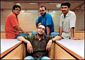 |
| The coffee club: (From left) Nima Namchu,
Kaushik Saha, Rahul Mukherjee, and Rajesh Bhardwaj |
No. 9
Nescafe: Kick-Starting Careers
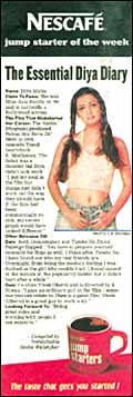 For
once, Nescafe gave its mushy-feely slice-of-life advertising a miss.
So models stretching-out with a mug of coffee or lovers in a coffee
bar were a no-no. Instead, the ads featured former Miss India and
filmstar Diya Mirza talking about her life and career. So where's
the coffee here, did you say? "It (the association with Diya)
is, in a way, what coffee stands for-achievement and performance,"
says Nima Namchu, Creative Director, McCann Erickson. Dovetailing
this ad was a series with other celebrity writers, actors, sportsmen,
even techies, all talking about moves that 'kick-started' their
careers. Call it what you will, basking in reflected glory or brand
building through indirect association. For
once, Nescafe gave its mushy-feely slice-of-life advertising a miss.
So models stretching-out with a mug of coffee or lovers in a coffee
bar were a no-no. Instead, the ads featured former Miss India and
filmstar Diya Mirza talking about her life and career. So where's
the coffee here, did you say? "It (the association with Diya)
is, in a way, what coffee stands for-achievement and performance,"
says Nima Namchu, Creative Director, McCann Erickson. Dovetailing
this ad was a series with other celebrity writers, actors, sportsmen,
even techies, all talking about moves that 'kick-started' their
careers. Call it what you will, basking in reflected glory or brand
building through indirect association.
-Supriya Shrinate
BRAND:Nescafe
CLIENT: Nestle India
AGENCY: McCann Erickson India, New
Delhi
CREATIVE TEAM: Shankar Nair (Creative
Director, left the agency), Anandroop Ghosh (Creative Group Head;
left the agency), and Rahul Mukherjee (Art Director)
No. 10
Maruti Suzuki Zen: Confident And Cool...
 Why
would Ami Vashi, Sunsilk Femina Miss India World 2003, in flaming
orange dress appear in the Zen car ad? And that too in Femina magazine,
the host of the pageant? Stylish, "a performer", and intelligent
is how Femina describes the modern Indian 'Woman of Substance'.
And with 15-18 per cent of the drivers behind the Zen's wheel being
women, it makes sense for Maruti to reinforce Zen's young 'confident
& cool' imagery with the Femina brand. Not surprisingly, it
has picked up the rights to shoot each year's pageant winner with
the car. Why
would Ami Vashi, Sunsilk Femina Miss India World 2003, in flaming
orange dress appear in the Zen car ad? And that too in Femina magazine,
the host of the pageant? Stylish, "a performer", and intelligent
is how Femina describes the modern Indian 'Woman of Substance'.
And with 15-18 per cent of the drivers behind the Zen's wheel being
women, it makes sense for Maruti to reinforce Zen's young 'confident
& cool' imagery with the Femina brand. Not surprisingly, it
has picked up the rights to shoot each year's pageant winner with
the car.
-Supriya Shrinate
BRAND: Maruti
Suzuki Zen
CLIENT: Maruti Udyog
AGENCY: Hakuhodo Percept, New Delhi
CREATIVE TEAM: Sangeeta Sen (Creative
Director), Ajay Kant Pathak (Creative Supervisor), and Jhulan Sengupta
(Art Director)
| The
Methodology |
|
HOW WE DID IT
|
»
Thirty-five TV campaigns and 50 print ads were
shortlisted, and checked on familiarity, perceptual ranking,
and scores on three other parameters
»
Survey sample was made up of 240 consumers, divided equally
across six cities: New Delhi, Mumbai, Chennai, Hyderabad,
Bangalore, and Kolkata
»
Respondents were asked to rank top 10 TV and top 10 print
ads, on overall opinion and three other parameters, on
a 10-point scale |
Business today commissioned multinational
research firm TNS India to conduct a survey to evaluate India's
top 10 television advertising campaigns and top 10 print ads
for the year 2003. This is the second survey of this nature
undertaken by BT, the first was done in 2002 (BT, March 17,
2002), conducted by NFO-MBL (which has since morphed into TNS
India).
We had the option of going to a panel of marketing or advertising
professionals. Instead, we decided to go to people who matter,
consumers. Tapping consumers meant that we faced the issue
of target group (TG) definition. All ads are geared towards
a specific TG. Ideally, the real test of the ad would be to
see how it fares amongst its intended TG. Going to each brand-specific
TG, however, had a problem, as there were too many TG definitions.
We, therefore, decided to go to a group cutting across demographics
to ensure inclusion of all kinds of campaigns and ads geared
towards all kinds of TGs.
The entire evaluation process involved the following phases:
- Sourcing of a comprehensive list of ads, for both TV
and print, from New Delhi-based advertising monitoring company,
TV/Print AD Index, vetted by TNS India and BT. The scope
of the study was limited to national TV campaigns and print
ads (defined as one that ran across more than one zonal
boundary). Also, for any TV campaign the constituent ads
should have had the same underlying theme and should have
run simultaneously or within a reasonable time period to
be considered a campaign. Only campaigns/ads in Hindi and
English were chosen for the evaluation.
- This list (around 100 TV campaigns and 350 print ads)
was further pruned by interviewing middle-level advertising
professionals across large advertising agencies, the criteria
being familiarity and how well, in their opinion, the campaign/ad
was received in the marketplace.
- The final short-list (35 TV campaigns and 50 print ads)
was then taken to consumers in six cities: New Delhi, Mumbai,
Chennai, Kolkata, Hyderabad and Bangalore. Forty consumer
interviews were done in each city. The TG was 15-40 years
of age, SEC A & B, and equally split between men and
women. Quotas were across occupational categories.
- Respondents were shown the short-listed TV campaigns
and print ads. They were first checked for familiarity of
the campaigns/ads. Then they were asked to evaluate all
the campaigns/ads they were familiar with, on overall opinion
and other parameters such as credibility, uniqueness and,
brand fit on a 10-point scale. Post this, respondents were
asked to rank the 10 campaigns/ads for TV and print.
- Familiarity and not just awareness of the campaigns was
used as an eligibility criterion for a respondent to be
able to judge the campaigns/ads. The extent of familiarity
was captured on a 10-point scale and only people familiar
with the campaign were asked to judge that campaign.
- To identify the top 10 ranked campaigns/ads, we wanted
to use a combination of parameters, which would help us
evaluate the campaigns or ads in a holistic manner. An approach
focus on the top rank or top three or five ranks did not
help much as some campaigns had a skewed response (few liked
them very much vis-à-vis others who liked them to
a much lesser extent). Therefore, the rankings of the best
campaigns were changing somewhat from the top rank list
to the top five list. Moreover, the evaluation procedure
also had to take care of the base, that is the percentage
of people familiar with the campaign/ad.
- We, therefore, adopted the following approach to arrive
at the top 10 television campaigns and the top 10 print
ads. First, we ensured a minimum familiarity level in order
to have a sufficient base for all campaigns, while at the
same time ensuring that campaigns or ads with a more focussed
audience did not lose out. Thereafter, in order to remove
bias due to the skewed rank responses, a minimum percentage
ranking was ensured for the top 10 ranks. And lastly, the
highly liked campaigns were segregated using mean ranking
(of the first top 10 ranks) on the familiarity base-the
lower the rank the better. A tie in mean ranks was resolved
in favour of that campaign, which fared better in the top
three approaches followed by the top ranking one.
|
|
